Forms and Checklists
Discover how to create, edit, delete, and export forms or checklists in mobohubb. Learn about available field types—from dates and signatures to conditional radio buttons—and advanced options like GPS, media uploads, and instant notifications to streamline your data collection process.
Forms and checklists are essential tools for gathering information or tracking tasks. A form collects data in a structured way, while a checklist details a sequence of steps that must be followed and verified. By setting up custom fields, specifying visibility, and adding optional features like GPS or media uploads, you can tailor each form/checklist to your organization’s needs.
In this guide you'll learn
- How to Add New Forms/Checklists with custom fields and user assignments
- How to Edit Existing Forms/Checklists and preview them on a mobile-like interface
- How to Delete Multiple Items at once to keep your workspace clean and organized
- How to Export and Import Your Data in Excel format for offline analysis or record-keeping
Forms Field Type Descriptions
Below is an overview of available field types for forms. Each field type defines the format and input of data you can collect:
| Field Name | Description |
|---|---|
| Checkbox | Allows the user to select or deselect an option. There’s no limit on how many boxes can be checked. |
| Colored Text | Displays text in a specific color for emphasis. |
| Date | Lets the user pick a date via an interactive calendar. |
| Device | Displays a devices list. |
| Restricts input to a valid email format. | |
| Hyperlink | Displays text that links to another web page or resource. |
| Password | Masks user input for secure entry. |
| Personnel | Shows a list of users. |
| Radio | A single-choice field (commonly known as “radio button”). |
| Read-only | Displays text that cannot be edited by the user. |
| Scan | Allows the user to scan a QR code or NFC tag. |
| Select | Lets the user pick an option from a drop-down list. |
| Signature | Enables the user to draw a signature. |
| Tags | Lets the user select one or more tags. |
| Text | A single-line free text input. |
| Text area | A multi-line text field for longer inputs. |
| Time | Lets the user pick a time via an interactive clock. |
Field Types Setup
When creating forms or checklists in mobohubb, you can choose from a variety of field types to collect or display information. Each field type serves a different purpose, from basic text input to advanced scanning or conditional display logic.
Checkbox
Allows the user to select or deselect an option. Multiple checkboxes can be checked at once, offering flexibility when you need more than one answer.
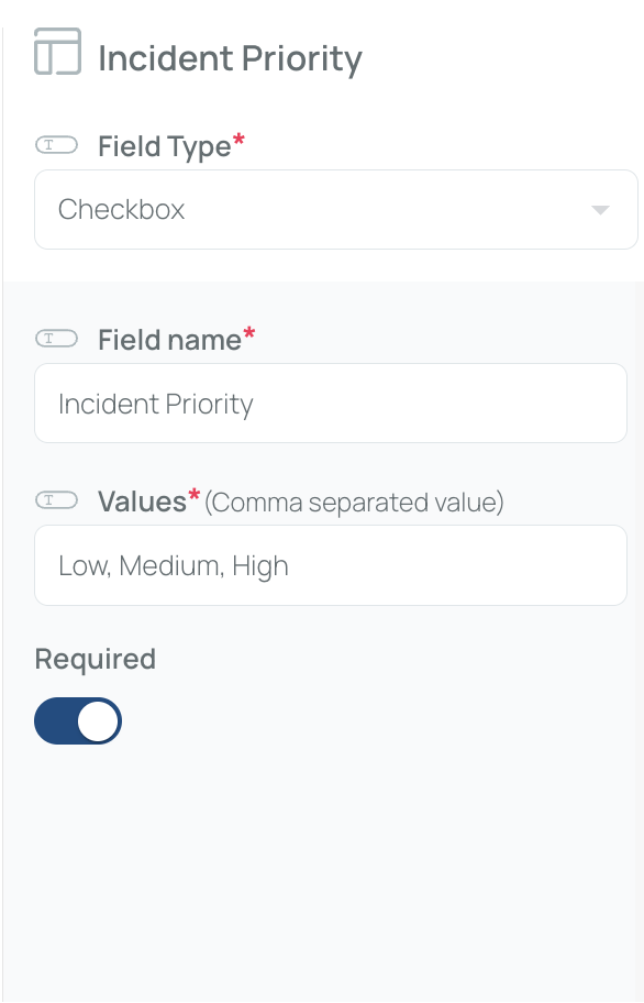
How to set up:
- Field Name (Title) – Provide a label for the checkbox group.
- Values (Comma-separated) – List the choices separated by commas.
Colored Text
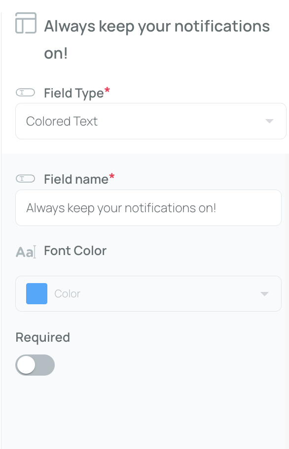
Emphasizes text by displaying it in a specific color.
How to set up:
- Field Name – Enter the text you want to highlight.
- Font Color – Choose a color from the dropdown menu.
Date
Lets the user pick a date via an interactive calendar.
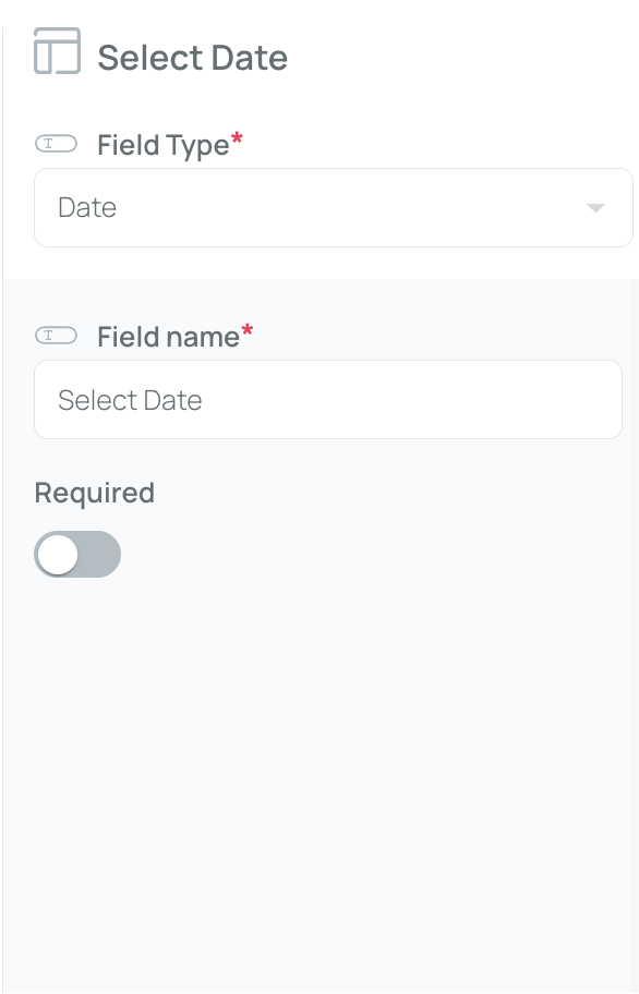
How to set up:
- Field Name – Provide a label for the date field.
Device
Displays a list of devices (smartphones, tablets, etc.) recognized by mobohubb.
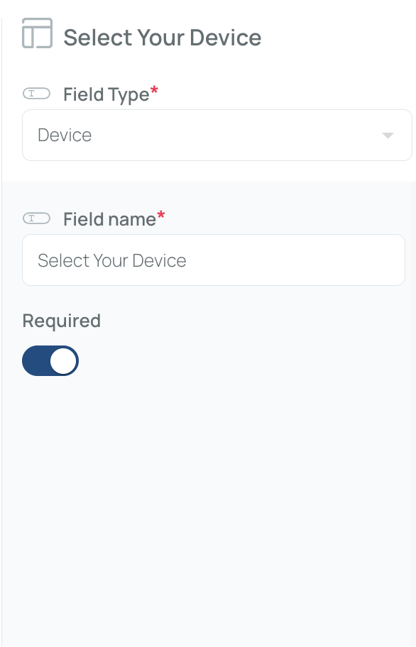
How to set up:
- Field Name – Give a name to the device field.
Email
Restricts input to a valid email format.
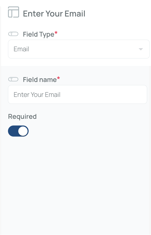
How to set up:
- Field Name – Provide a label for the email field.
Hyperlink
Displays text that links to another web page or resource.
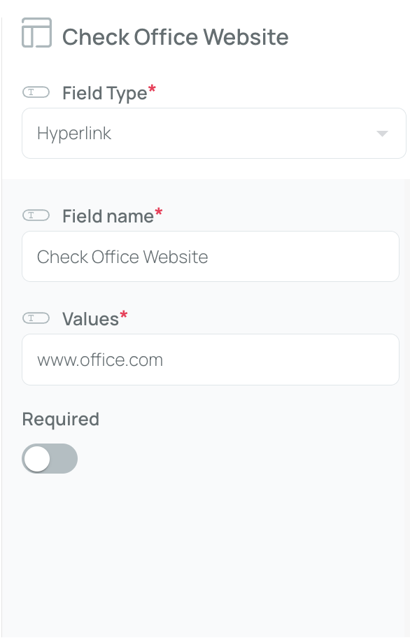
How to set up:
- Field Name – Enter the text that will appear as the link.
- Values – Include the URL that the text should link to.
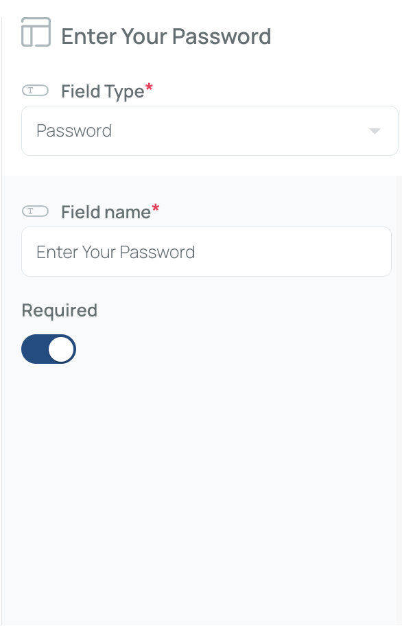
Password
Masks the user input for secure entry (e.g., sensitive codes).
Personnel
Shows a list of users registered in mobohubb. They can be associated with a particular tag for filtering.
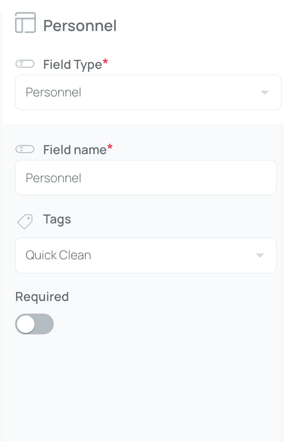
How to set up:
- Field Name – Provide a label for this field.
- Tag (optional) – Associate the field with a predefined tag if you want to filter the user list.
Radio
A single-choice field (often called a radio button). Users can select only one option. For Select or Radio fields, you can activate “conditional” to display more fields based on user selections.
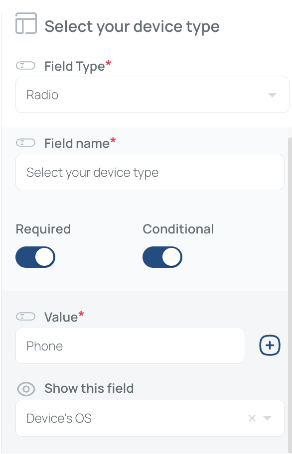
If the user chooses "Phone", they will be required to complete the "Device's OS" step.
How to set up:
- Field Name – Provide a title for your radio group.
- Values (Comma-separated) – List each choice separated by commas.
- Conditional (optional) – Show additional fields if a user chooses a specific option. If a user completes a certain action, then another step is triggered.
Read-only
Displays text that cannot be edited by the user.
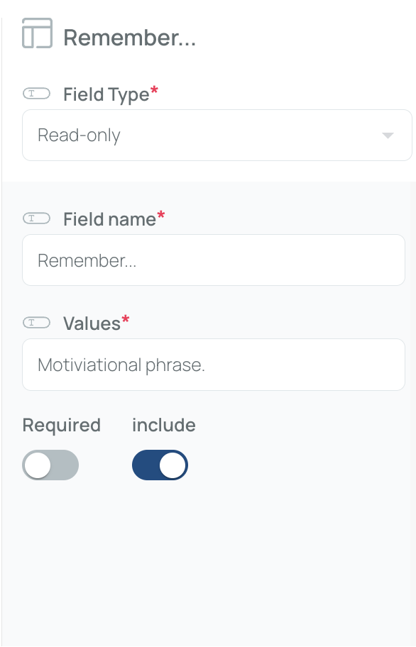
How to set up:
- Field Name – Enter a label for the field.
- Values – Specify the text to display.
- Mark include if you want the text visible in the forms.
Scan
Allows scanning a QR code or NFC tag.
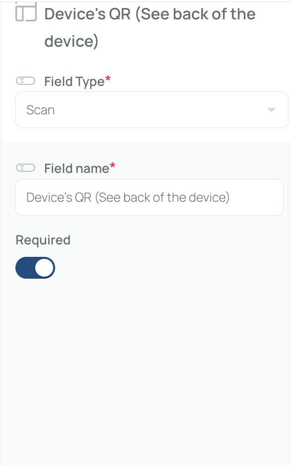
How to set up:
- Field Name – Provide a label for this field.
Select
Lets the user pick an option from a drop-down list. You can also activate a “conditional” option to show more fields when a user selects a specific value.
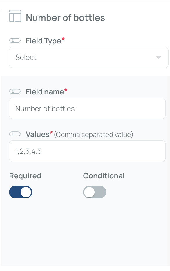
How to set up:
- Field Name – Label the drop-down.
- Values (Comma-separated) – List each selection item by item.
- Conditional (optional) – Reveal extra fields based on the user’s choice. If a user completes a certain action, then another step is triggered.
Signature
Enables the user to draw their signature on the form.
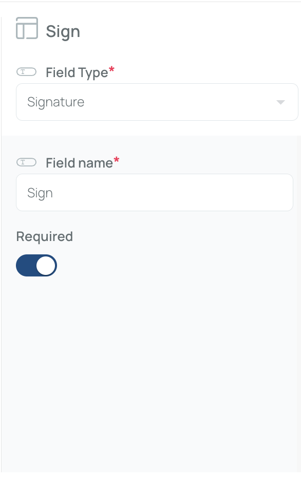
How to set up:
- Field Name – Provide a name for the signature field.
Tags
Lets users pick one or more tags from a predefined list.

How to set up:
- Field Name – Provide a label.
- Tag Source – Make sure the tags are already created in mobohubb.
Text
A single-line free text input box.
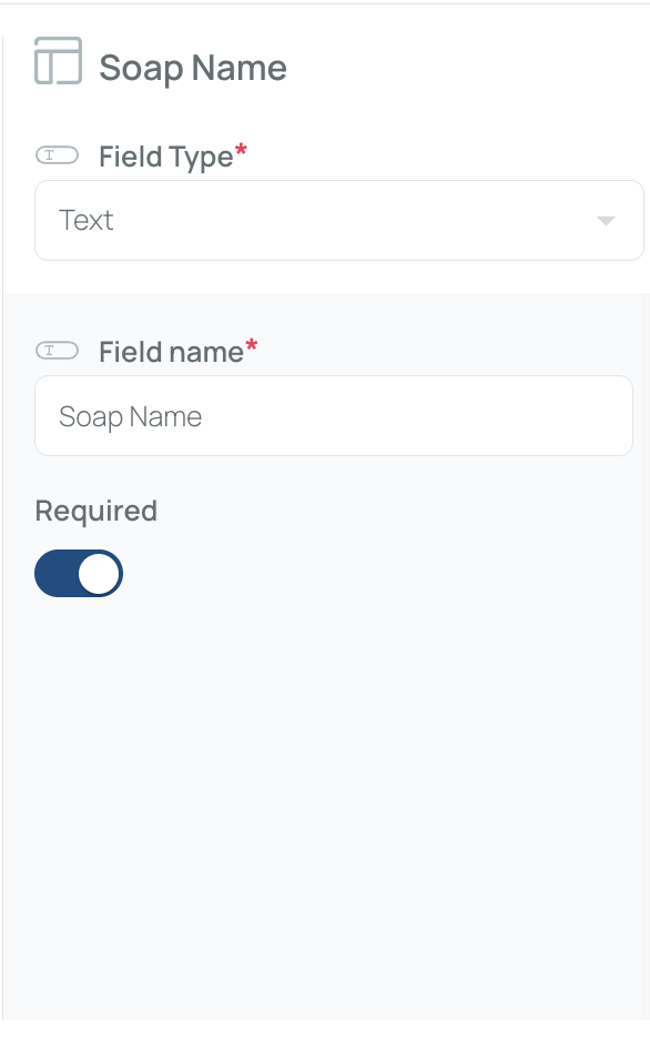
How to set up:
- Field Name – Title for the text field.
Textarea
A multi-line text box for longer input.
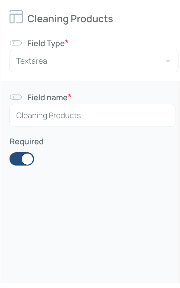
How to set up:
- Field Name – Provide a title for your text area.
Time
Lets the user pick a time via an interactive clock.
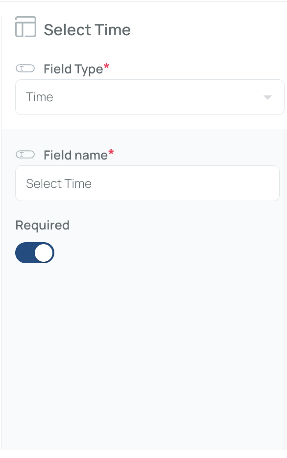
How to set up:
- Field Name – Provide a label.
By combining these field types, you can create tailored forms and checklists for a variety of processes—anything from simple text capture to scanning codes and gathering signatures. This flexibility ensures each form is optimized for the data you need to collect within mobohubb.
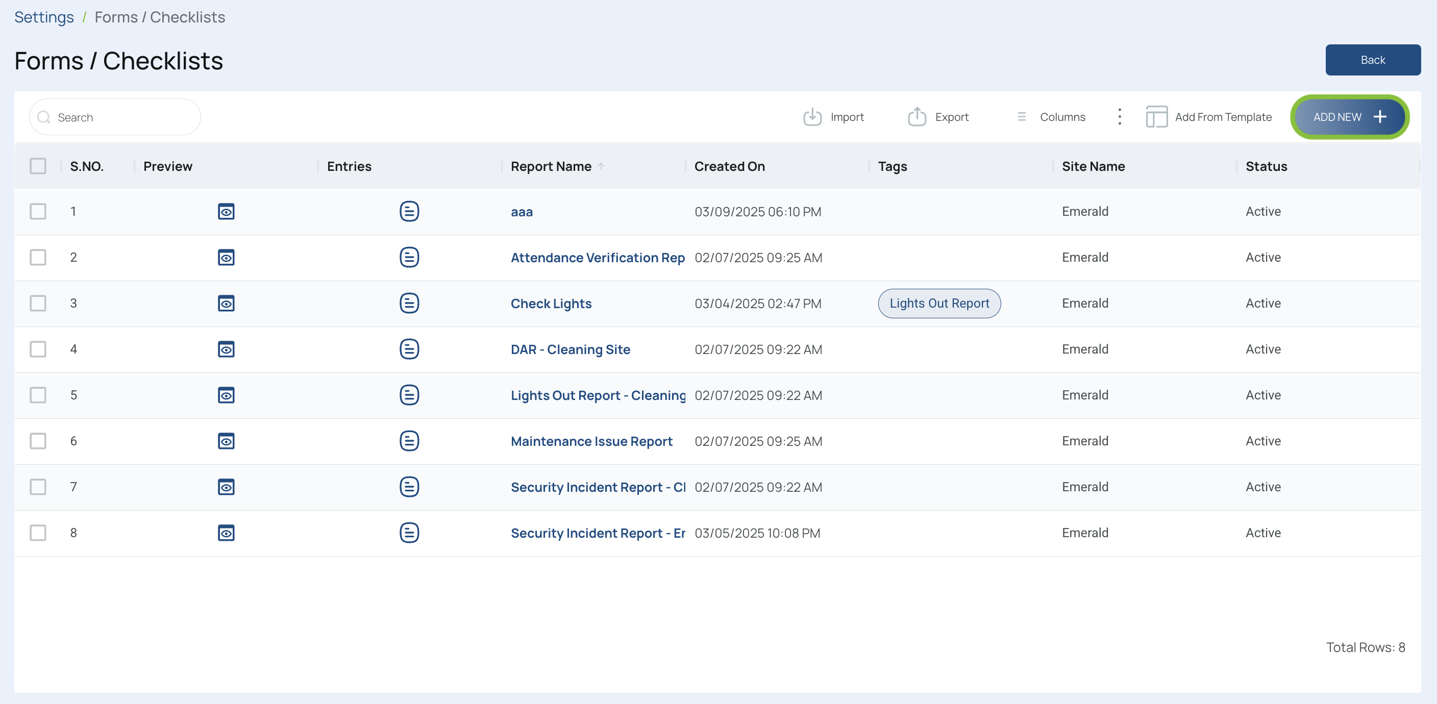
Add Forms or Checklists
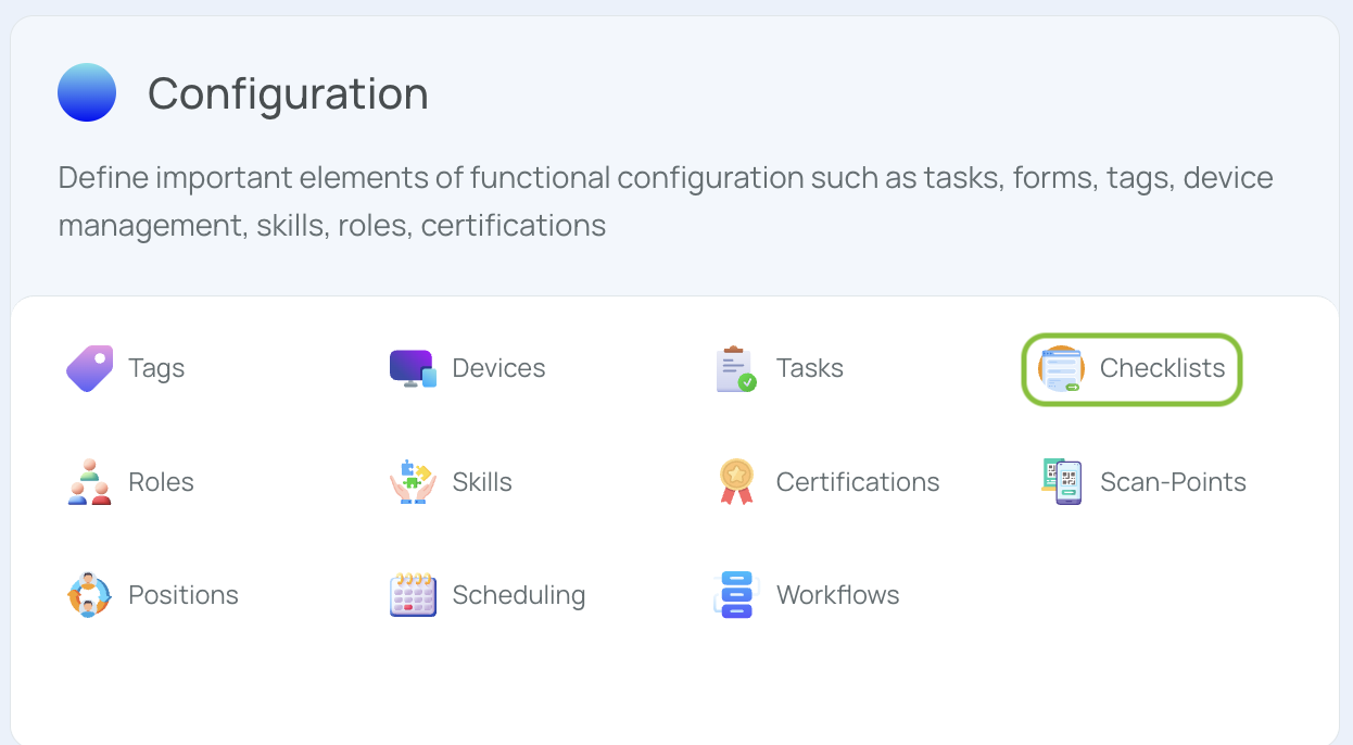
- Navigate to the Portal’s Top Menu and select Settings from the dropdown.
- From the Configuration section, select Checklists.
- Click “Add New”.
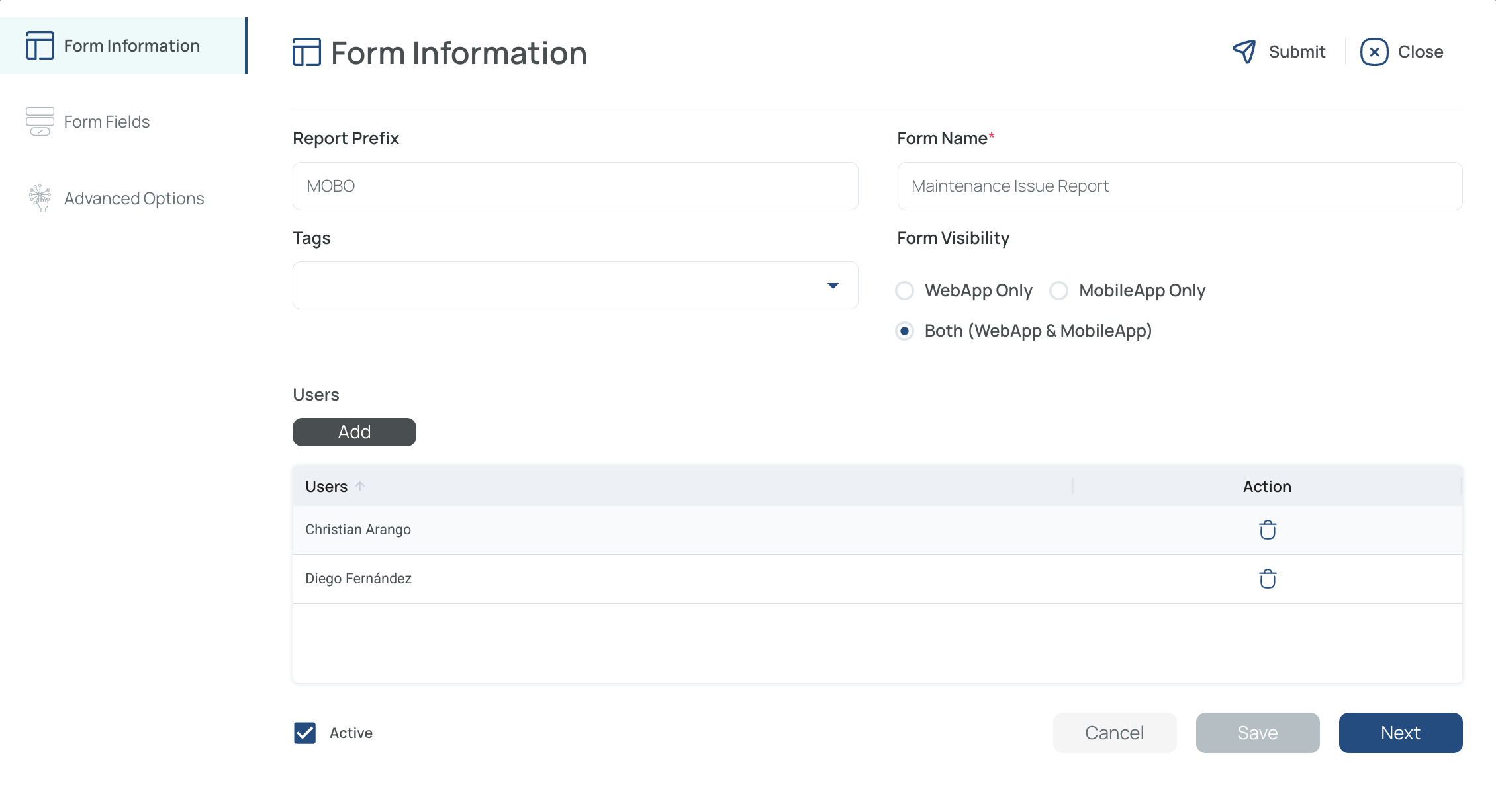
- Fill in the Form Information
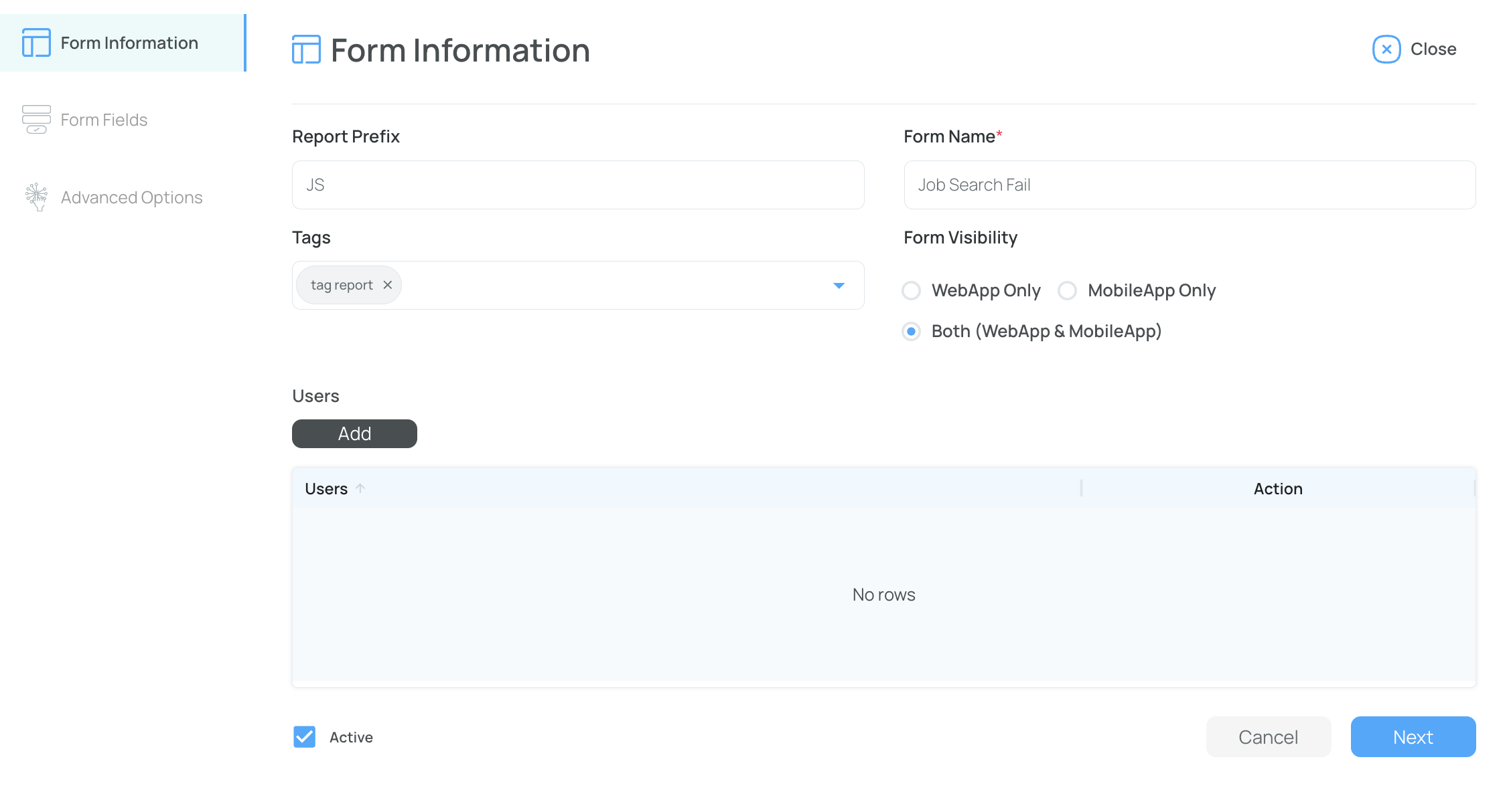
- Prefix: A short, unique code (letters, numbers, symbols).
- Name: The form’s title should be clear and descriptive.
- Tag: Select a predefined tag if needed.
- Visibility: Choose web app, mobile app, or both.
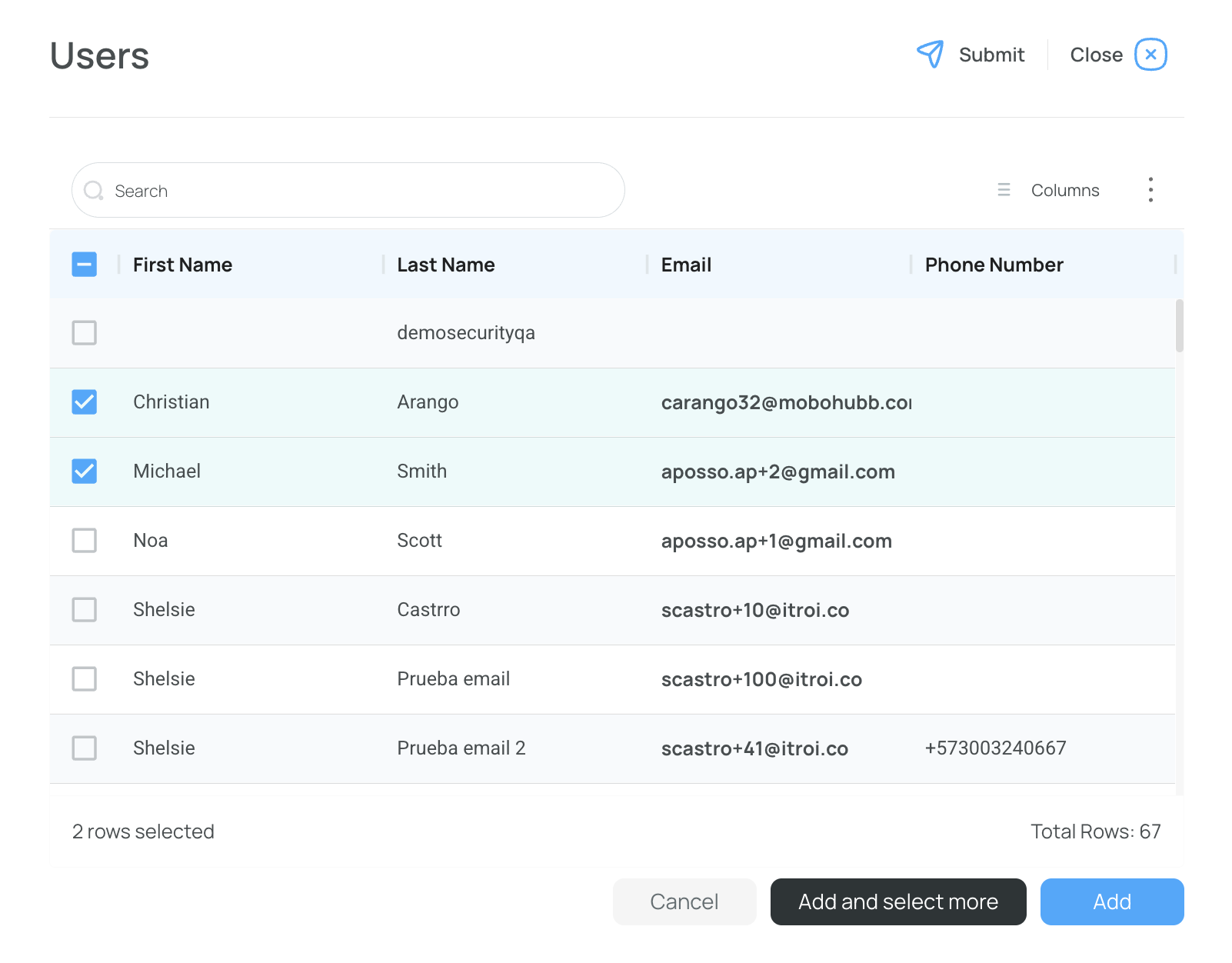
- Choose users for the task. If left blank, it will be available for everyone.
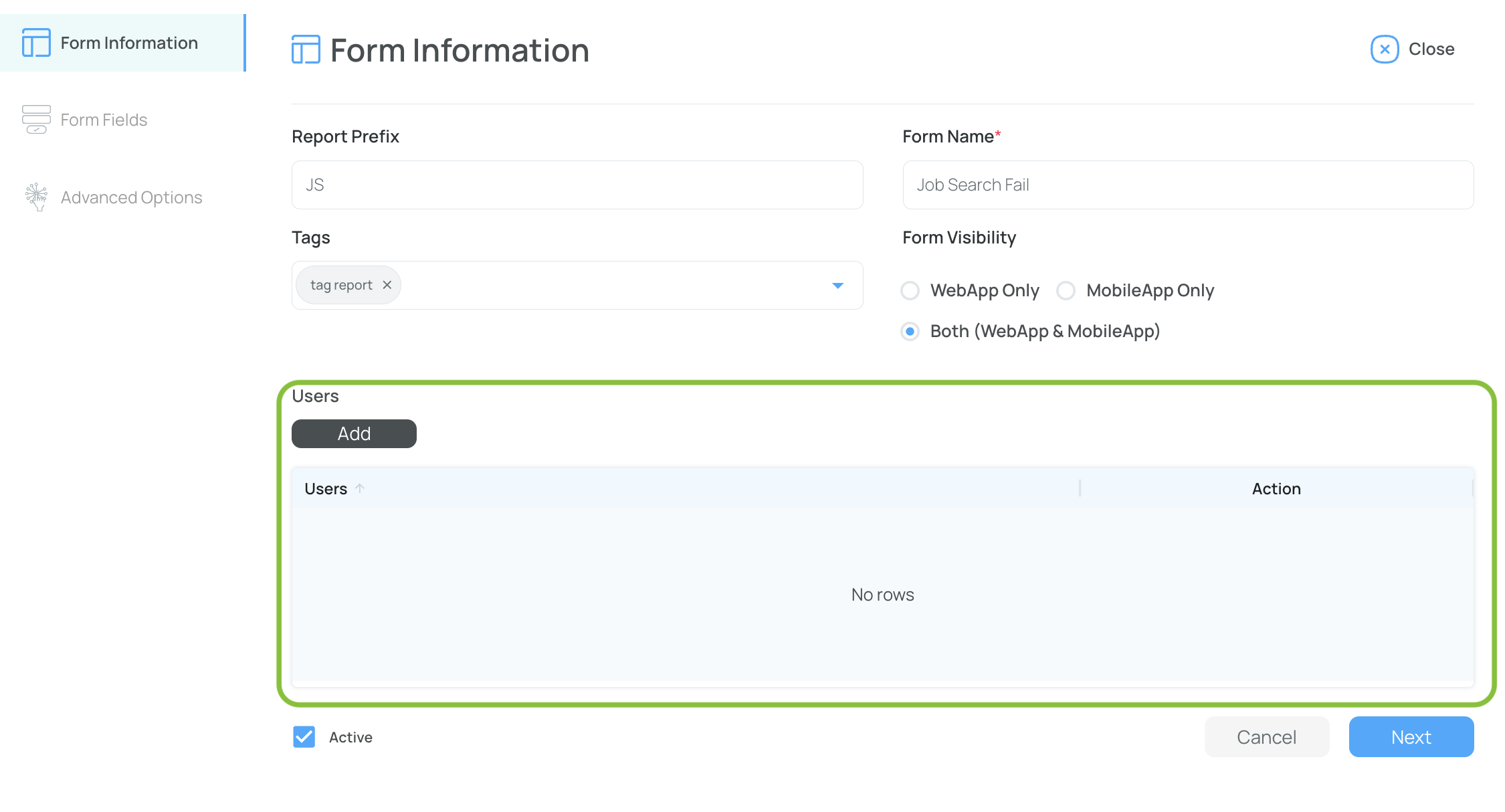
- Activate: Check the box to enable the form immediately or leave it unchecked to hide it.
- Click “Next” to Go to “Form Fields”
- Fill In the Form Fields
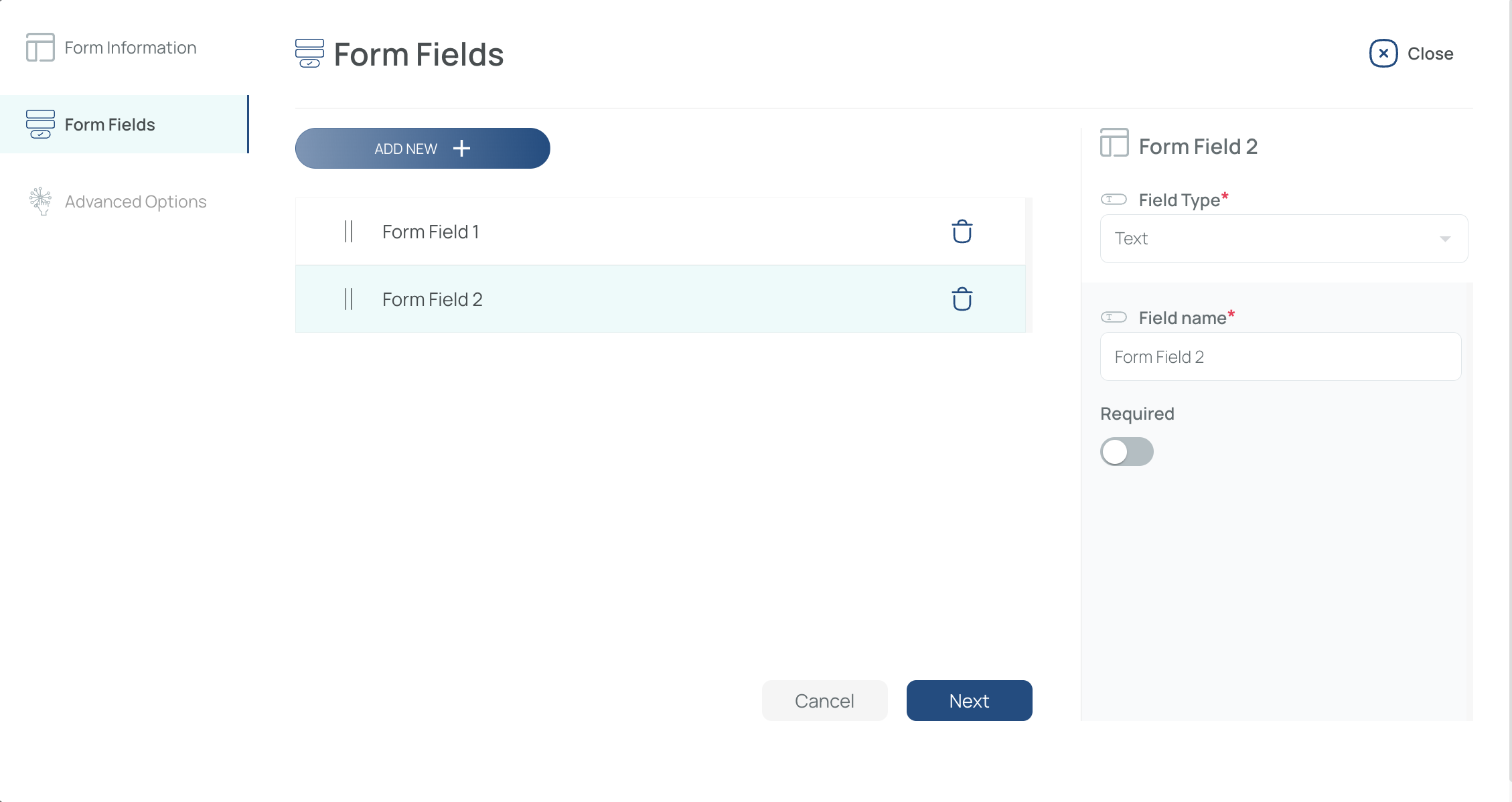
- Add New Fields: By default, one field exists. Click “Add new” to add more.
- Configure Field Type: Choose from text, date, time, select, checkbox, radio, signature, scan, etc.
- Field Name: The label visible to users (e.g., “Employee ID,” “Comments”).
- Required: Mark fields as required (checkbox) or optional.
- Conditional Fields: For Select or Radio types, activate “conditional” to display additional fields based on user choices.
- Click “Next” to Go to “Advanced Options”
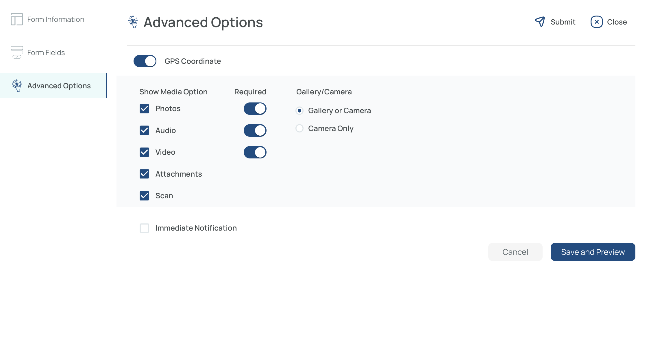
- Fill In Advanced Options
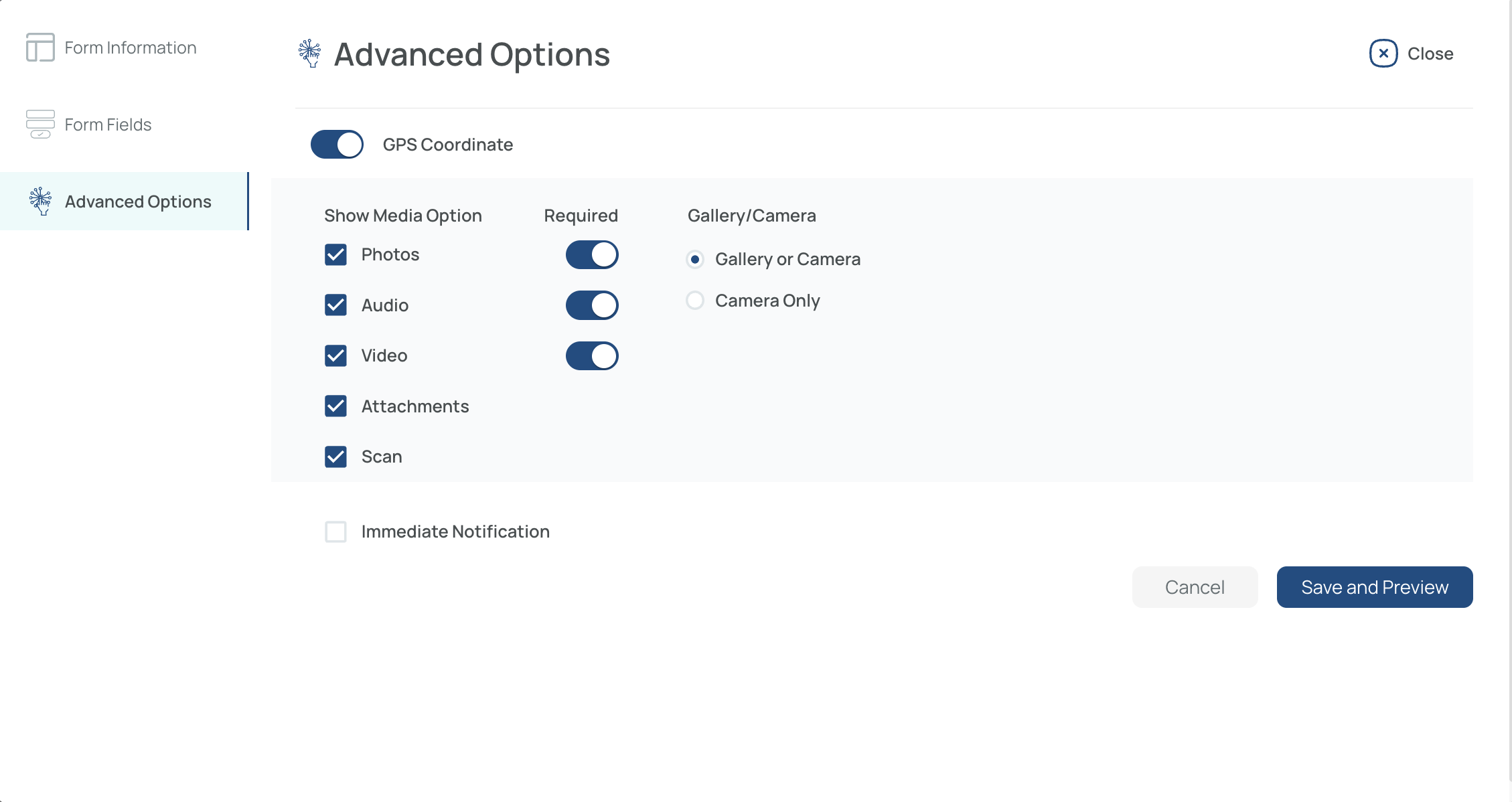
- GPS Coordinate: Enable or disable geolocation for your form.
- Media Options: Allow photos, audio, video, attachments, or scans.
- Mandatory Media: Check if a photo/audio/video is required or optional.
- Camera/Gallery: Let users capture media with their device or choose from gallery (or camera-only mode).
- Immediate Notification (Optional)
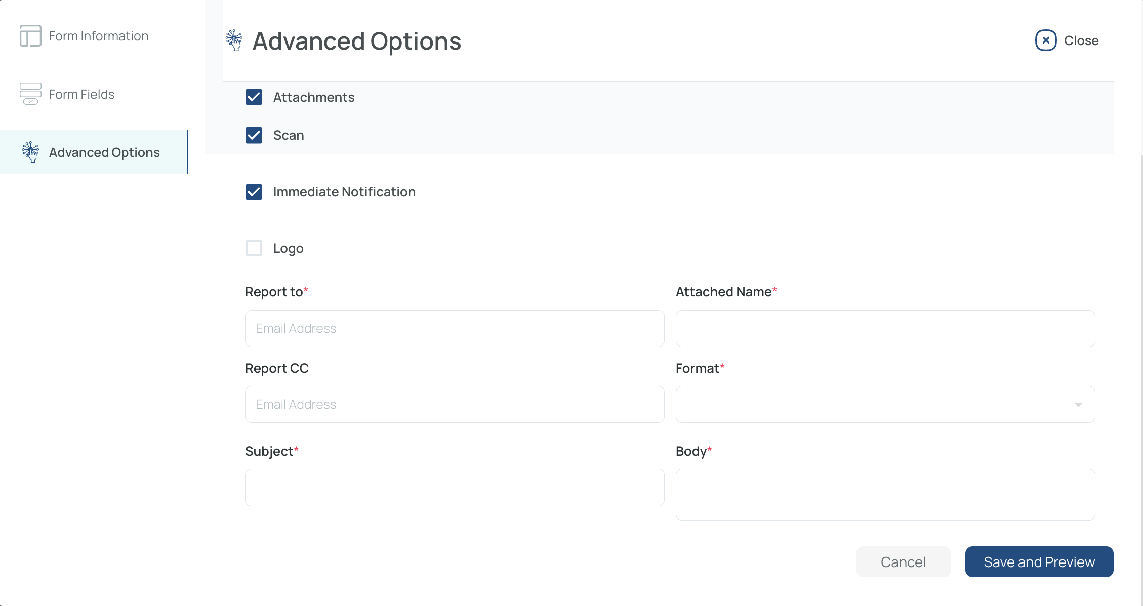
- Sends an email alert upon form submission.
- Specify recipients, subject, body, format (PDF, HTML, Excel), and attachment name.
- Save and Activate Preview
- Finalize your form settings and see how it looks (especially on mobile).
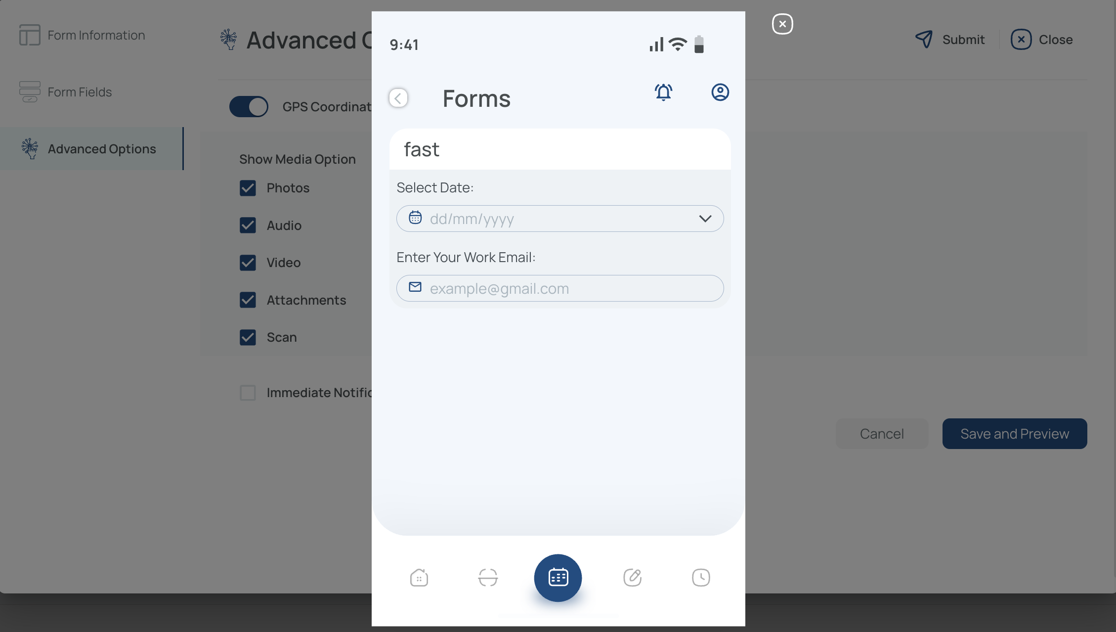
Note: The preview reflects how your form or checklist will appear in the mobile application.
Once complete, your form or checklist can be accessed by the selected users, who can fill it out according to its defined rules and constraints.
Edit Forms or Checklists
- Click the name of the form or checklist you want to modify.
- Update the current information as needed.
Form Information: Update the prefix, name, tags, visibility, or assigned users.
Form Fields: Add or remove fields, change field types, update field names, modify mandatory settings, or adjust conditional logic.
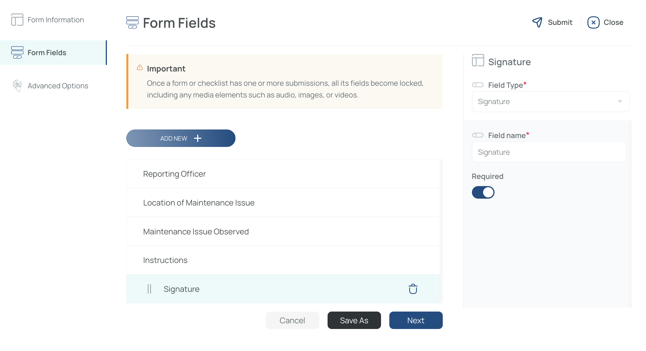
You can now add fields to existing forms that already contain data. However, the system will warn you that the existing data will be lost.
To avoid losing data, click Save as instead.
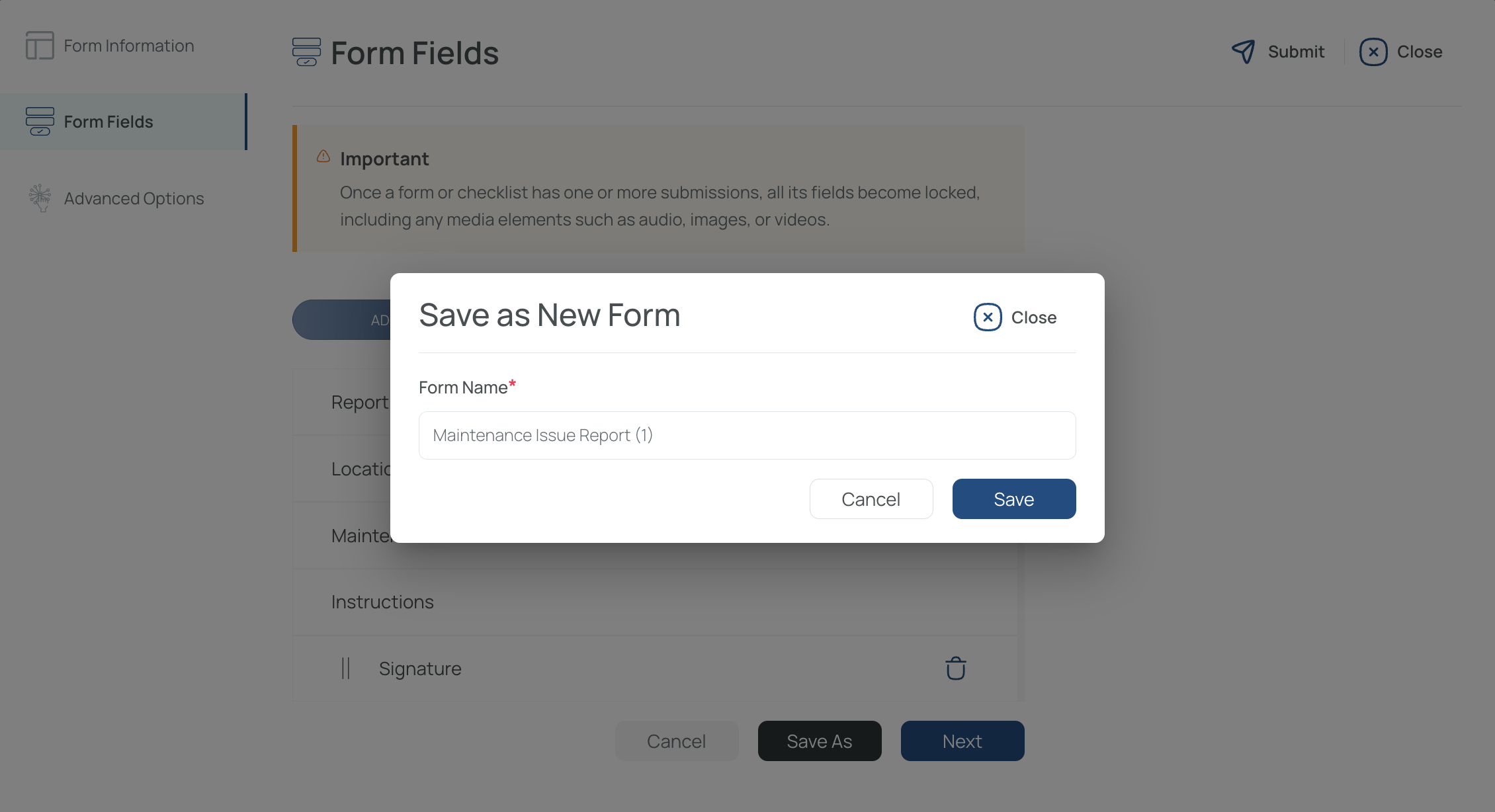
This opens a new save window with the Form Name field automatically populated with the original form name plus (1), indicating that the form will be saved as a copy or alternate version. You can keep that suggested name or change it to the name you want before saving.
When you save it, the system creates a new blank form with no existing data. This new form can then be assigned to a user, shift, or task.
If you try to edit an existing field in a form that already contains data, the system will display an error message because those fields cannot be modified.
Forms that already contain data cannot be deleted.
Advanced Options: Adjust GPS usage, media settings, or immediate notification preferences.
- Save and Preview
- When you click “Save,” you’ll automatically see a smartphone preview of how the form/checklist looks on mobile.
- Close the preview to return to Forms/Checklists Management.
Note: The preview reflects the mobile app layout for the form or checklist.
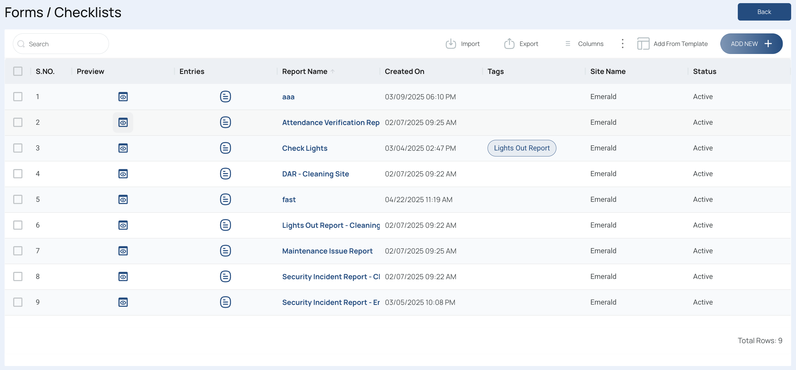
Delete Forms or Checklists
-
Select the items to remove and Click "delete".
- Use filters to find them easily.
- You can select multiple forms/checklists at once.
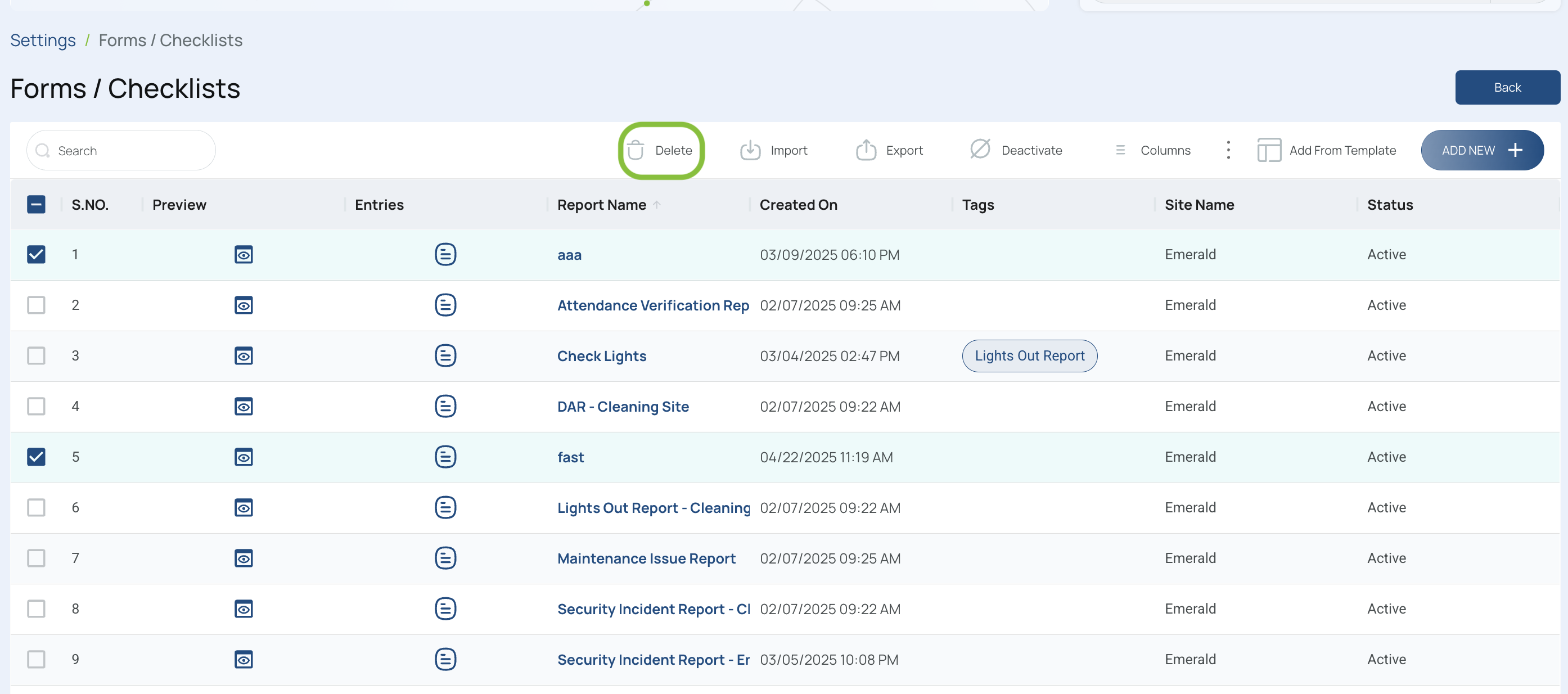
-
Confirm and Close
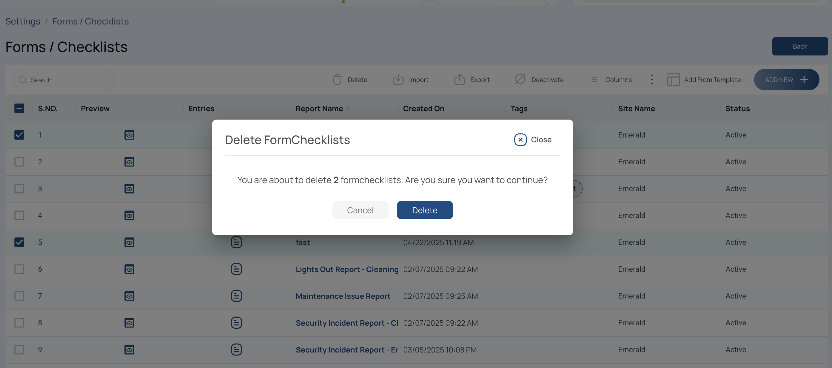
- Verify the count of forms/checklists matches what you intend to remove.
- Click Delete to finalize.
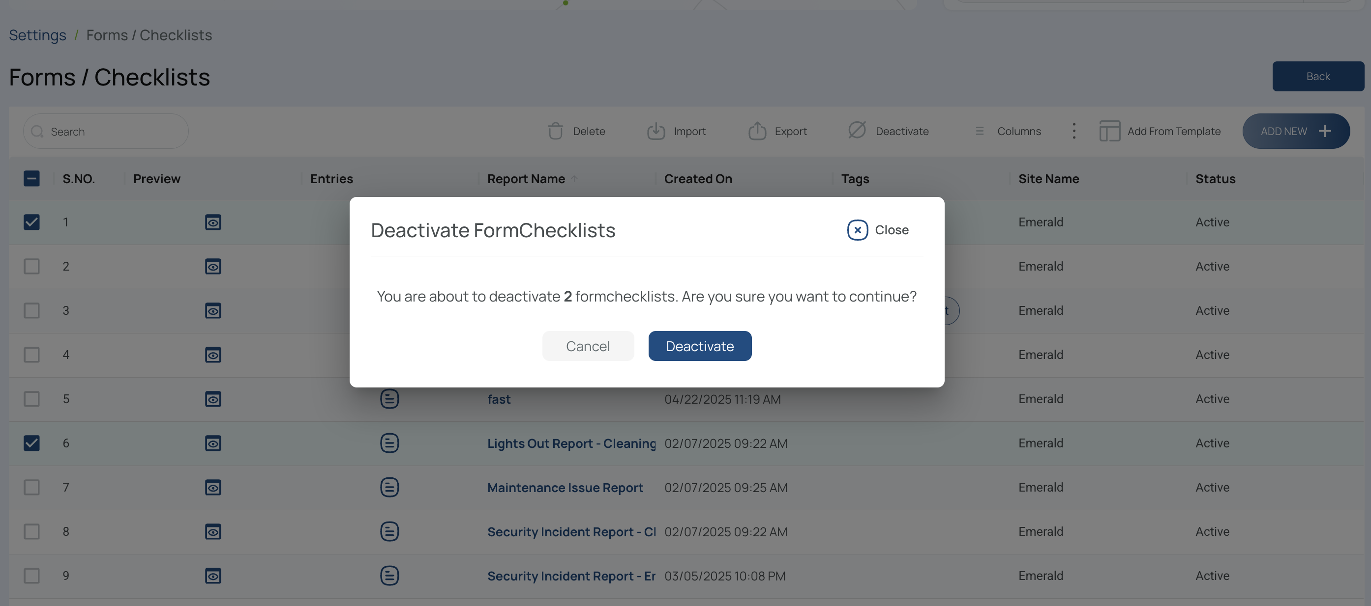
Activate/Deactivate Forms or Checklists
- Select the items to activate/deactivate, and click activate/deactivate accordingly.
- Use filters to find them easily.
- You can select multiple forms/checklists at once, but they must have the same status (active or inactive).
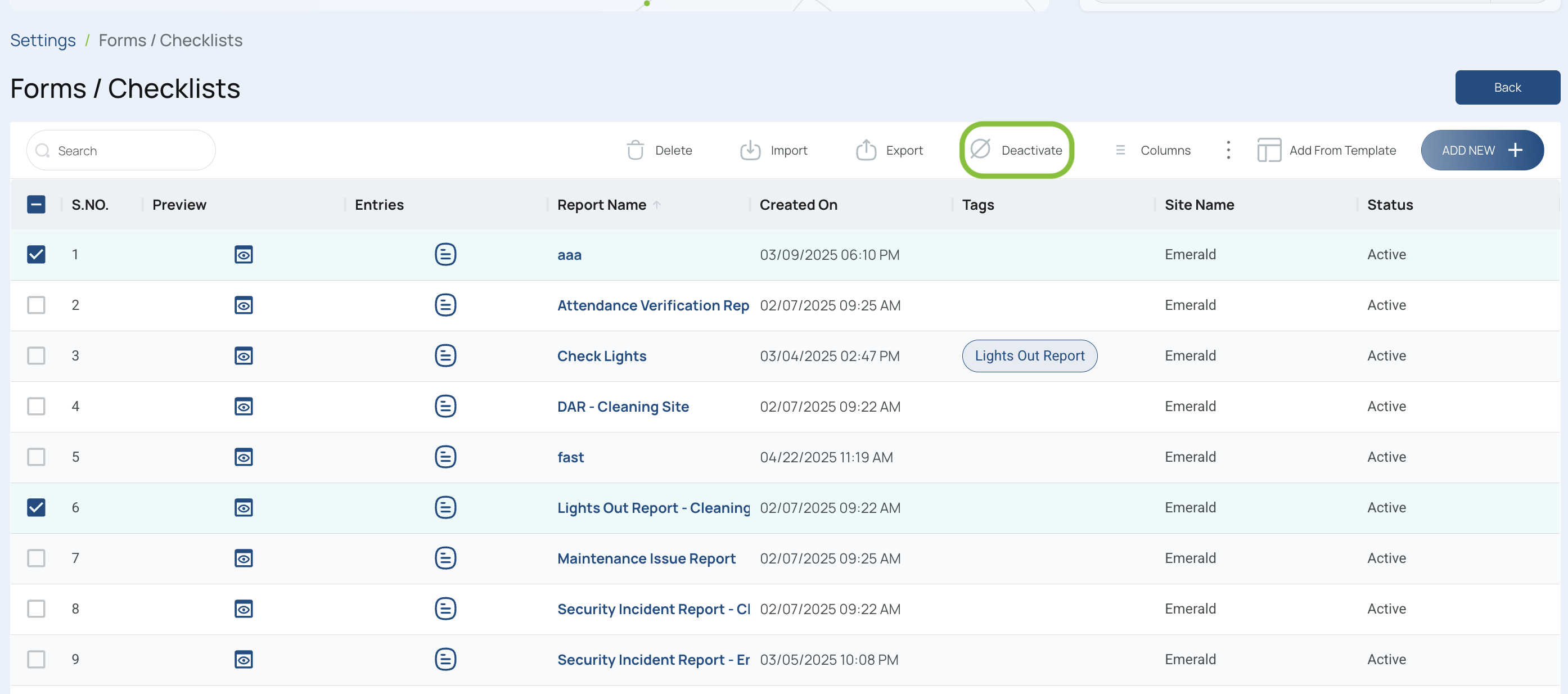
- Confirm and close
Export Forms or Checklists
To export forms/checklists (e.g., for archiving or analysis):
- Click “Export”.
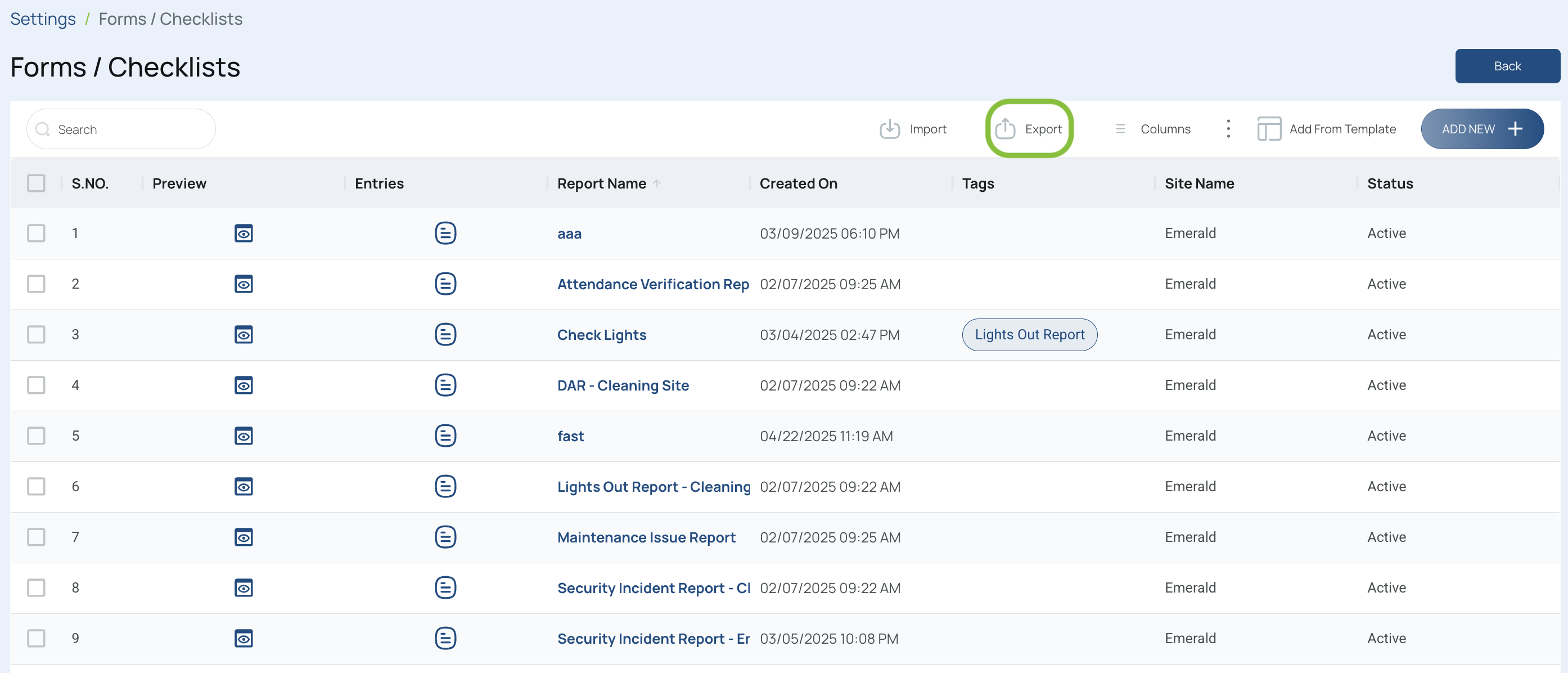
- Choose which data to export
- You can typically export All information from the current view.
- If the file is within size limits, it will download to your computer in Excel format.
- If it exceeds size limits, check the “Downloads” option in the platform.
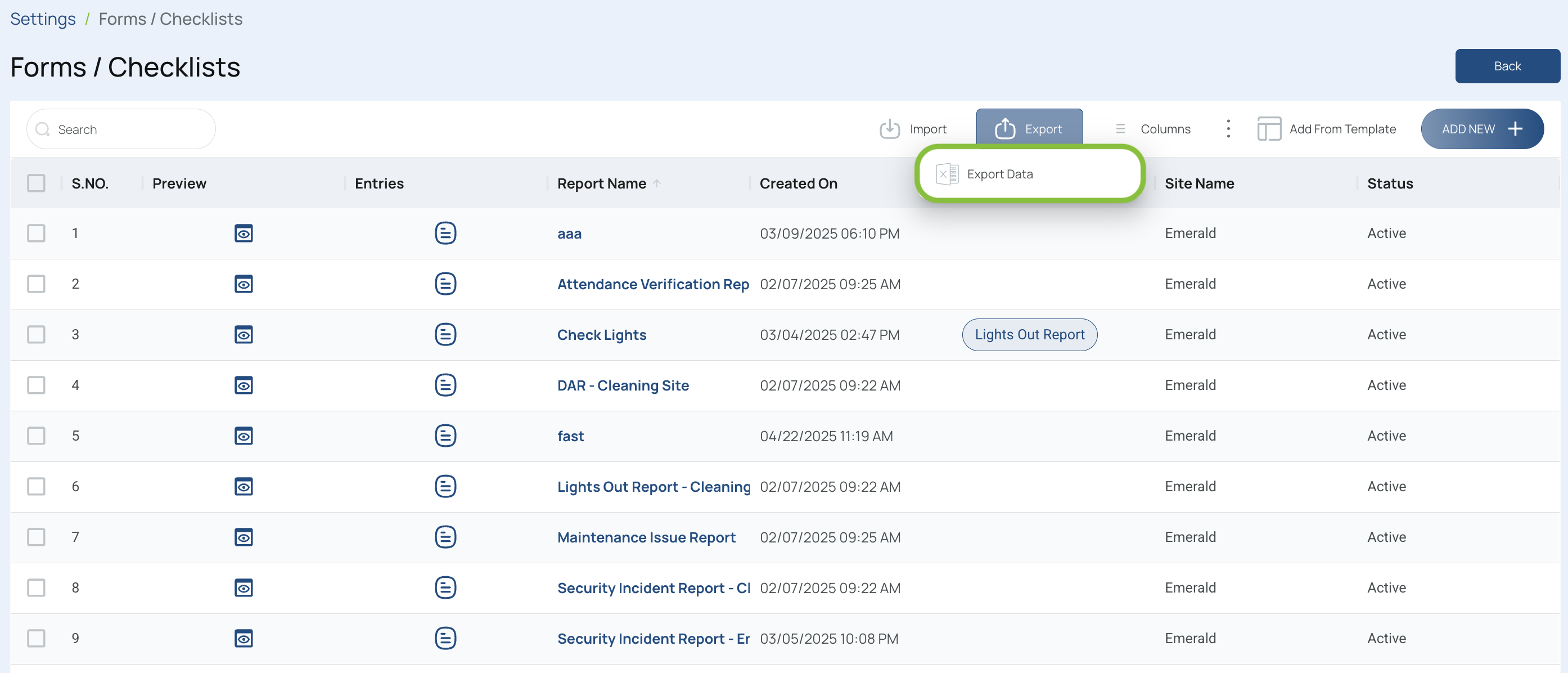
Once complete, you’ll have an Excel file containing all relevant data for your forms or checklists.
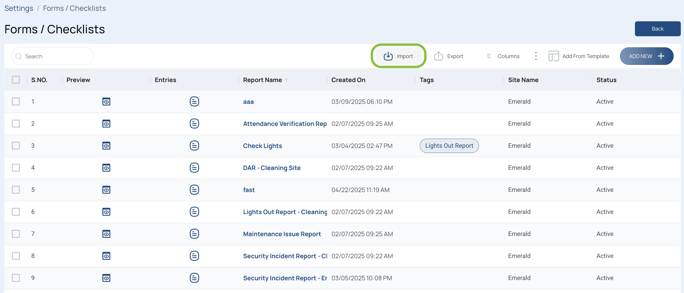
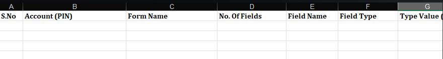
Import Forms and Checklists
- Click the "Import" button.
- Press "Download Template".
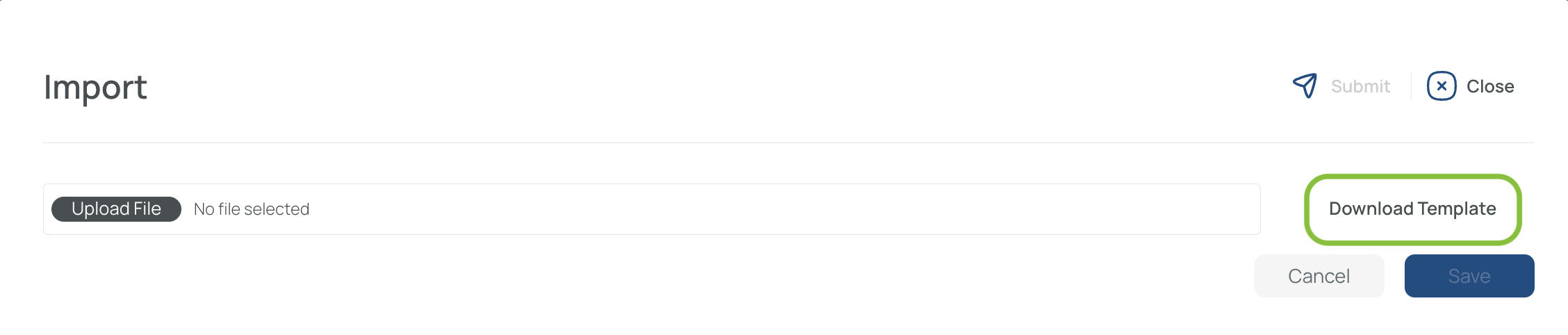
- Fill in the template.
- Send the completed template with the required information to support so that we can assist you with the import process.